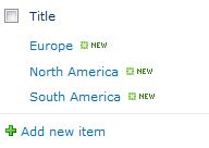
Quite often, I'm being asked to provide an option for cascading drop-down lists that also filter based on the selections made by the user on the previous drop-down list. A few examples when this could be asked are filtering countries based on region selected, filtering schools based on district, filtering departments based on divisions, filtering parts based on model vehicle, and many more. I'm going to give an example for region and country. You can replace this with any other options that fit your needs. You are going to need the following: - 2 custom lists (one of the region and another one for the country) - Document library or list that will use the 2 custom lists mentioned in the bullet above - Document library where to save your code to - jQuery (you can download it from here: http://docs.jquery.com/Downloading_jQuery) - SPSServices jQuery (you can download it from here: http://spservices.codeplex.com/releases) I managed to make it work using jquery-1.8.1.min and jquery.SPServices-0.7.1a.min. You may want to try other versions if it doesn't work for you. Sometimes it's a bit of trial and error, like with many SharePoint things. 1. Download the two files and upload them to a document library in SharePoint of your choice and to which you have permissions over in the site; 2. Create the first custom list. In the example, I'm going to name it lookupRegion. Then I'm going to modify some settings, such as removing the ability to attach files, as well as adding a description ("This is the region name") and enforcing unique values for the Title column. Then I'm going to add a few values in there: 3. Create the second custom list. In the example, I'm going to name it lookupCountry. Then I'm going to remove the ability of attaching files (in the list settings) and then I'm goint to make some changes to the Title column, as well as create a second column, as follows,
Title: Add a description ("This is the country name") and enforce unique values;
Region: Create a region column; this column is a lookup column to the Title field in the lookupRegion custom list and it is a required column (you want to make sure that a region is provided).
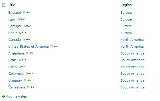
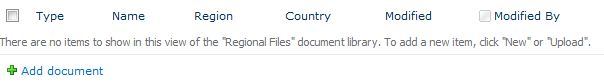
4. Add a few values in this list: 5. I will now create a Regional Files document library (you can create a list if not) and I will create one column named Region (lookup column to the lookupRegion list Title column) and another column named Country (lookup to the lookupCountry Title column.) 6. Using Notepad, create a file and type in the following:
<script language="javascript" src=" /URL_to_your_code_location_on_your_SharePoint_site/jquery-1.8.1.min.js"></script>
<script language="javascript" src=" /URL_to_your_code_location_on_your_SharePoint_site/jquery.SPServices-0.7.1a.min.js"></script>
<script language="javascript" >
$(document).ready(function() {
$().SPServices.SPCascadeDropdowns({
relationshipList: "lookupCountry",
relationshipListParentColumn: "Region",
relationshipListChildColumn: "Title",
parentColumn: "Region",
childColumn: "Country",
debug: true
});
});
</script>
Note: Replace the text in blue above with the URL to the location of your files on your SharePoint site. I prefer to use absolute URLs.
7. Save the file under the name of cascadingdropdown.js (this is very important).
8. Upload this file to the same library where you saved your other jQuery files, or to any other library of your choice.
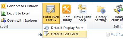
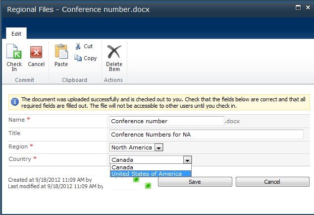
9. Go back to the Regional Files document library and select Default Edit Form from the Form Web Parts icon in the Customize Library section of the ribbon. 10. Insert a Content Editor Web Part to the page. Edit the web part, give it a meaningful name, remove the chrome, and select hidden in the Layout section. Then reference to the cascadingdropdown.js file (in the Content Link section of the tool pane.) Apply your changes and save ([OK]) the web part. Save and close the page.
11. Upload a file and see if it works. The image below shows that it works for me. Some last explanations about the parameters used:
relationshipList: This is the name of the list where we have kept the relationship (in our example, lookupCountry);
relationshipListParentColumn: This is the parent column (Region) in the relationship list (lookupCountry);
relationshipListChildColumn: This is the child column (Title) in the relationship list (lookupCountry);
parentColumn: This is the parent column (Region) in the library (or list) where we want to implement this (Regional Files);
childColumn: This is the child column (Country) in the library (or list) where we want to implement this (Regional Files).
I frequently receive requests for displaying contents of a list in an A-Z index of sorts where items also need to be grouped by the first character in their title or name or some other value. I know there are different ways of solving this. This post provides a "crude" way of satisfying this request using Calculated columns. Let's say that the Title column is the one that needs to be sorted alphabetically. I then create a calculated column (for our example, we're going to name it IndexCode) and I use the formula: code([Title])This returns the code for the first character in the string contained in the Title column. In some cases, that's all I need. However, since this formula returns a numeric value (65 for A, 66 for B, 67 for C, and so forth), it might not be useful when you need to display it on a page. So my next step is to convert that number back to a character. For this, I created yet another calculated column (continuing with our example, we're going to call Index) and this time I use the following formula: char([IndexCode])
This formula returns the character specified by the code number in the IndexCode column (A for 65, B for 66, C for 67, etc.). Now I can use this one in, for example, Content Query Web Parts for grouping my items. Lastly, users may not care for typing things in upper case. If this is something you may want to use for your index, you may want to use the upper([ColumnName]) formula. For more formulas that you can use in SharePoint, you may want to visit this other web site.
The table below provides some shortcuts you can use in SharePoint 2010. Dedicated to those who do not like using the mouse or trackball. Enjoy!
| SharePoint Shortcuts | | Site Navigation | | Navigate forward/backward through selectable items | <TAB>/<SHIFT>+<TAB> | | Tip: The TAB key also works when selecting items on the ribbon. Press <Enter> to select. | | Display all site content | <ALT>+<3>,<Enter> | | Open [Site Actions] menu | <Alt>+</>,<Enter> | | Place cursor in Search box | <Alt>+<S>,<Enter> | | Go to Home page | <Alt>+<1>,<Enter> | | Open Help | <Alt>+<6>,<Enter> | | Expand selected drop-down menu | <Alt>+<↓> | | Cancel changes in a dialog box | <Alt>+<C> | | Save changes and close dialog box | <Alt>+<O> | | Select the Skip to main content menu | <Alt>+<X> | | Content Navigation | | Move cursor to the right | <→> | | Move cursor to the left | <←> | | Move cursor up one line | <↑> | | Move cursor down one line | <↓> | | Move cursor forward one word | <Ctrl>+<→> | | Move cursor back one word | <Ctrl>+<→> | | Move cursor to the start of a line | <Home> | | Move cursor to the end of a line | <End> | | Move cursor up one paragraph | <Ctrl>+<↑> | | Move cursor down one paragraph | <Ctrl>+<↓> | | Move cursor up one page | <Page Up> | | Move cursor down one page | <Page Down> | | Move cursor to beginning of content | <Ctrl>+<Home> | | Move cursor to end of content | <Ctrl>+<End> | | Content Editing | | Choose text font | <Ctrl>+<Shift>+<F> | | Create numbered list item | <Ctrl>+<Shift>+<E> | | Create bulleted list item | <Ctrl>+<Shift>+<L> | | Increase indent | <Ctrl>+<M> | | Decrease indent | <Ctrl>+<Shift>+<M> | | Align left | <Ctrl>+<L> | | Align center | <Ctrl>+<E> | | Align right | <Ctrl>+<R> | | Clear all formatting | <Ctrl>+<Space> | | Surveys | | Respond to selected survey | <ALT>+<N>,<Enter> | | Display all received survey responses | <ALT>+<U>,<Enter> | | Display a graphical summary of survey responses | <ALT>+<R>,<Enter> | | Save and Close in a form for editing responses | <ALT>+<S> | | Open the Survey Settings menu | <ALT>+<I> | | Navigate to the next survey page | <ALT>+<N> | | Calendar View | | Press <Alt>+</> to go to the Site Actions menu and then use <Tab> or <Shift>+<Tab> to navigate between items on the calendar. | | Web Parts | | Navigate to the next Web Part | <ALT>+<W> | | Open a Web Part | <Enter> | | Open a Web Part menu (with the Web Part selected) | <Tab>,<Enter> | | Save changes to a Web Part | <Alt>+<Y> | | Save changes and close the editing pane | <Alt>+<O> | | Cancel changes and close the editing pane | <Alt>+<C> |
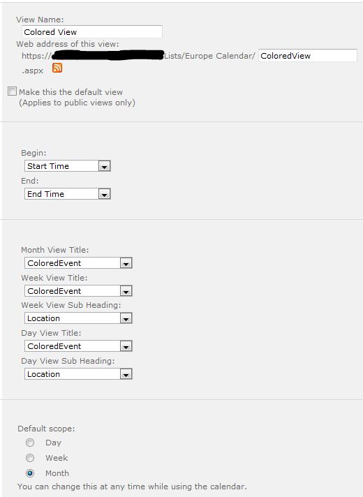
One request we frequently receive is to allow to colour events in a Calendar list for easier finding and viewing. Path to SharePoint offers a script that you may want to check. And that's basically what I did; didn't feel like reinventing the wheel. So go here and follow the instructions. If you have any questions about the original site, contact Christophe@PathToSharePoint.com But before you start, make sure you have the following: - Calendar list ready to be used - A choice column of your preference, which will be use to categorize the events on your Calendar list - A displayed column already designated (for example, Title) - A separate Colour column (calculated value) - Another calculated value column (for example, ColouredEvent) Follow the instructions on that site and you should be all set. If you have any doubts, I can assure you we were able to successfully implement this solution on SharePoint 2010. It might get a little bit tricky when you have to create the view that will display the colour-coded events. If you don't pick the right columns, it won't work. Find below a sample image of how the Calendar view should be set up. The final thing you will need is to reference the script from the page where you are displaying the coloured view of the Calendar list. To do so, upload the script to a document library, go back to the page where your calendar view displays, edit it to insert a Content Editor Web Part (CEWP), and reference the script file from the CEWP). Save and publish the page. It should work.
One request we frequently receive is to display fly-out menus, the Top Nav in place of the Quick Launch, or both. I recently found a way to completely move the Top Nav to display where the Quick Launch would normally display and hide the Quick Launch at the same time. This is what I did.
1. Make a copy of the v4.master master page, check it out, rename it, and open it to edit it;
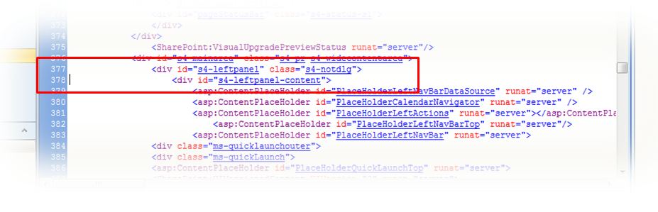
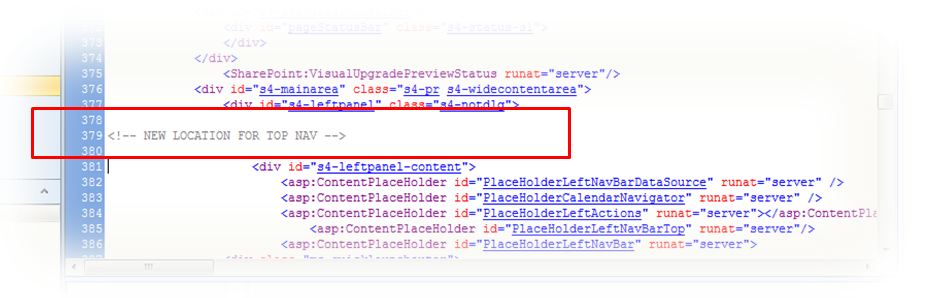
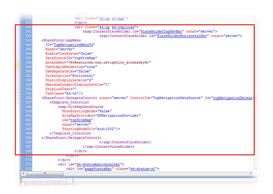
2. Assuming you have still not made any changes to your copy of the v4.master content, go to line 377. 3. I like inserting notes for future reference. So in this particular case, I'm going to insert a comment in between lines 377 and 378, as follows,
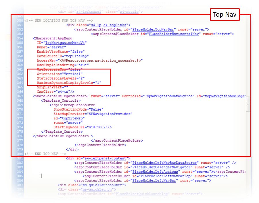
3. Once again we're going to assume you have still not made any further changes to your copy of the master page. Scroll back up and go to line 340. Select lines 340 through 368 and move this to where you inserted your comment for the Top Nav's new location. 4. Now you need to change the Top Nav orientation from horizontal to vertical. In the sample image below, this is done at line 362. Change the default setting where it says Orientation="Horizontal" to Vertical. You can also make adjustments to the static and dynamic display levels and maximum based on your site needs.
5. We also need to hide the Quick Launch so it only displays the Top Nav. To do this, scroll back to the top of your copy of the master page and locate the closing </head>. Once again we'll assume you have not made any other changes that the ones included in this blog post. Therefore, the closing </head> tag should be located at line 35. Insert a line or two between lines 34 and 35 and type in the following, <!-- BEGIN ADDED LINES TO HIDE QUICK LAUNCH --> <style type="text/css">
#s4-leftpanel-content
{
display:none;
}
</style>
<!-- END ADDED LINES TO HIDE QUICK LAUNCH -->
6. Save, check in, publish, and approve the page. Note: If you need to further customize the site for other colours than the ones used by the SharePoint theme applied to the site, you will need to further modify your copy of the master page to register your external CSS file and make a copy of the corev4.css CSS file where you can made your customizations. To learn how to register your external CSS file on your master page, visit my blog post here. For a clean copy of the corev4.css file, visit my Useful Files section. Hint: The following is a list of the main CSS classes that control the look and feel for the Top Nav: - .s4-tn - .s4-tn ul.static - .s4-tn li.static > .menu-item - .s4-tn u.dynamic - .s4-tn li.dynamic > .menu-item - .s4-tn li.dynamic > a:hover - .s4-tn li.static > a:hover - .s4-toplinks .s4-tn a.selected - .s4-toplinks .s4-tn a.selected:hover
It is not unusual that customers will ask for list filters to be created. While many users who are used to SharePoint would probably use the column headers to filter, not all users are SharePoint savvy and that's how I get those requests.
This solution will show how to create an alternative for those cases when customers want something looking more like a regular Web page and not like a SharePoint list.
The elements I usually use for this solution are:
- Filters (Blank Web Part) page
- Custom list with the information to be filtered
- HTML Form Web Parts, one per needed filter
- HTML custom code
- Data Connections
Step 1 - Create Custom List
For the sake of time, I'm going to assume you have your custom list already created, including views and everything else. In my example, I'm going to be using a very simple list that tracks people on duty for three available shifts (morning, afternoon, and evening).
Step 2 - Create Filters Blank Web Part Page
In SharePoint, go to the Pages library and create a Blank Web Part Page and name it Filters or anything else that might better suit your needs.
Step 3 - Add HTML Form and List Web Parts to the Filters Page
Edit the Filters page and add one HTML Form web part for each filter you are going to be needing plust the Clear All Filters button within the web part zone or zones of your choice. Add the custom list view web part somewhere on the page, as well. And don't forget to edit the list web part to apply the list view of your choice.
I don't like the web part chromes, or their titles. So I usually remove all those settings and I add Content Editor Web Parts right above or next to the HTML Form Web Parts to include meaningful text for my users and I format the text to my needs. So feel free to do so, as well.
Step 4.a - Provide Appropriate HTML Code - Clear All Filters
Edit the HTML Form Web Part that will be acting as the Clear All Filters button.
Select [Source Editor...] at the Form Content Editor section of the web part tool pane. This is how the code usually looks:
<div onkeydown="javascript:if (event.keyCode == 13) _SFSUBMIT_"><input name="T1"/><input value="Go" onclick="javascript:_SFSUBMIT_"/></div>
One comment about this code. I don't know in your experience, but in mine, many users do not really understand what 'Go' means. So for this reason, I always prefer to change that to either Clear All Filters, or Apply Filter depending on my situation. So in this case, it is going to be renamed to Clear All Filters. And I also modified the rest of the code to look like this:
<div style="text-align: left">
<input onclick="location.href='https://SiteURL/Pages/Filters.aspx'" value="Clear All Filters"/>
</div>
(Note: If the code above gives you trouble, see the note added on August 2012 at the bottom of this post)
If you would prefer a different alignment, replace left with either right, or center. Replace SiteURL in the code above to the full path to your Filters page. Save the web part. This code will simply "refresh" the page to make it look like the list has been cleared of all filters when selected (clicked).
Step 4.b - Provide Appropriate HTML Code - By Person
Edit the HTML Form Web Part that will be acting as the first of your filters; in our example, the first filter will be used to filter the list based on person name. Select [Source Editor...] at the Form Content Editor section of the web part tool pane and replace the code with the following,
<left>
<div onkeydown="javascript:if (event.keyCode == 13) _SFSUBMIT_">
<select name="Title">
<option value=""></option>
<option value="Anne">Anne</option>
<option value="Jane">Jane</option>
<option value="Mary">Mary</option>
<option value="Susan">Susan</option>
<option value="Tim">Tim</option>
</select>
<input type="button" value="Apply Filter" onclick="javascript:_SFSUBMIT_"/></div>
</left>
If you would prefer a different alignment, replace left with either right, or center.
Since I used the Title column to save the names on my list, this is the value I input where it reads select name, even when I renamed that column to Name. It is important to point out that the code will only work with the internal name of the column.
The first option value remains with no option for when nothing has been selected, yet. Replace the rest of the values and add or remove lines to matching your needs.
Save the web part.
Step 4.c - Provide Appropriate HTML Code - By Shift
Repeat all the steps in section 4.b and replace the code with the following,
<left>
<div onkeydown="javascript:if (event.keyCode == 13) _SFSUBMIT_">
<select name="Title">
<option value=""></option>
<option value="Morning">Morning</option>
<option value="Afternoon">Afternoon</option>
<option value="Evening">Evening</option>
</select>
<input value="Apply Filter" onclick="javascript:_SFSUBMIT_"/></div>
</left>
Make changes as appropriate to match your needs and save the web part.
Step 5 - Establish the Data Connections
This is where people may differ on how to proceed. Some people use SharePoint Designer to establish the data connections. However, for simple data connections like the ones in this example, you may establish them within SharePoint itself. And that's what I'm going to explain in the next lines.
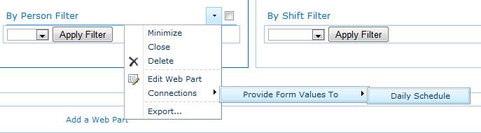
Edit the first HTML Form Web Part (By Person). Select Connections > Provide Form Values To > Daily Schedule (or the name of your list).
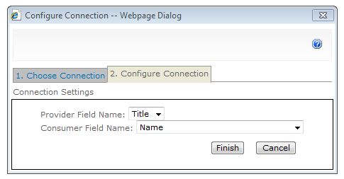
SharePoint displays the Choose Connection web page dialog. In the 1. Choose Connection tab, select Get Filter Values From at the Connection Type drop-down list and then select [Configure].
SharePoint switches to the 2. Configure Connection tab. Select the Provider Field Name (for our example, that would be Title) and the Consumer Field Name (For our example, Name) from the respective drop-down lists and then select [Finish].
Edit the second HTML Form Web Part (By Shift). Select Connections > Provide Form Values To > Daily Schedule (or the name of your list).
SharePoint displays the Choose Connection web page dialog. In the 1. Choose Connection tab, select Get Filter Values From at the Connection Type drop-down list and then select [Configure].
SharePoint switches to the 2. Configure Connection tab. Select the Provider Field Name (for our example, that would be Title) and the Consumer Field Name (For our example, On Duty) from the respective drop-down lists and then select [Finish]
Save the page. Test the filter buttons. If everything looks satisfactory, check the page in (and publish it if publishing is turned on for your site).
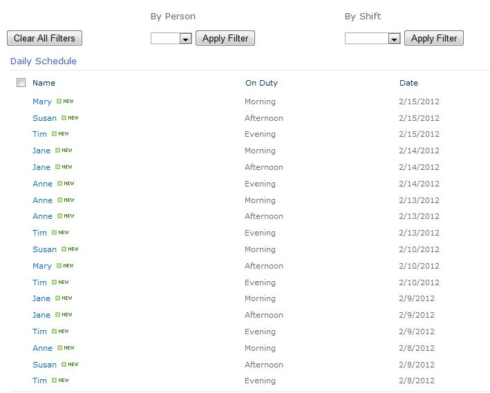
This is how my page looks like now:
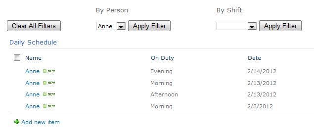
If I apply the By Person filter for 'Anne,' this is how it looks:
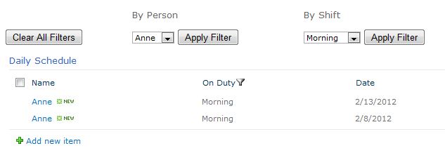
And this is how it looks if I apply both By Person = Anne and By Shift = Morning.
Note: When teaching your site users how to apply these filters, you will need to point out that they will need to select [Apply Filter] for all the filters they would like to apply, one at a time.
UPDATED January 2013: I had some problems reusing the code for the Clear All Filters button at a different customer. I had to swap some things around and this is the resulting code, which you can try if you are experiencing problems, as well:
<div onkeydown="javascript:if (event.keyCode == 13) _SFSUBMIT_"><input type="button" value="Clear All Filters" onclick="location.href='https://SiteURL/Pages/Filters.aspx'"/></div>
Bonus: Code for ABC Filter
<div onkeydown="javascript:if (event.keyCode == 13) _SFSUBMIT_">
<select name="IndexChar">
<option value=""></option>
<option value="A">A</option>
<option value="B">B</option>
<option value="C">C</option>
<option value="D">D</option>
<option value="E">E</option>
<option value="F">F</option>
<option value="G">G</option>
<option value="H">H</option>
<option value="I">I</option>
<option value="J">J</option>
<option value="K">K</option>
<option value="L">L</option>
<option value="M">M</option>
<option value="N">N</option>
<option value="O">O</option>
<option value="P">P</option>
<option value="Q">Q</option>
<option value="R">R</option>
<option value="S">S</option>
<option value="T">T</option>
<option value="U">U</option>
<option value="V">V</option>
<option value="W">W</option>
<option value="X">X</option>
<option value="Y">Y</option>
<option value="Z">Z</option>
</select>
<input value="Apply Filter" onclick="javascript:_SFSUBMIT_"/></div>
</left>
"Hiding" would be a better way of describing what I'm about to say, since "Removing" will make SharePoint not render properly.
In other words, I do not recommend removing any Content Place Holders from SharePoint master pages. I recommend turning them off.
So let's say that you need to hide or remove the Search area from a SharePoint site.
Using SharePoint Designer, open your copy of the v4.master master page.
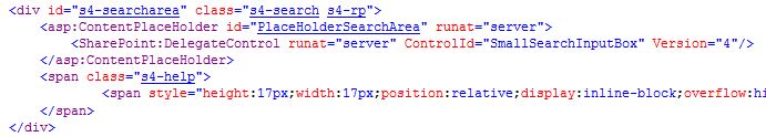
Locate the following piece of code:
If you have still never made changes to your copy of the v4.master master page, the lines of code I'm talking about go from line 330 to 337.
Tip: Using SharePoint Designer Split View, select the Search box in the lower Design frame and SharePoint will highlight the code in the upper Code frame.
Delete what you don't need. For most of my projects, I delete the entire <div>, starting with the <div id="s4-searcharea" class="s4-search s4-rp"> all to the closing </div> right after the </span>.
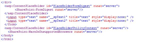
Go to the bottom of the Master Page in the Code view. Locate the following lines of code:
Insert a couple of lines right above the closing </form> tag and type the following:
<!-- Lines below added for unused Content Place Holders -->
<asp:panel visible="false" runat="server">
<asp:ContentPlaceHolder id="PlaceHolderSearchArea" runat="server" />
</asp:panel>
<!-- End added lines for unused Content Place Holders -->
Save, check in, and publish your master page. Go to the browser and test to see how it looks.
I sometimes receive a request from my customers to completely remove the first tab from the Top Nav.
SharePoint 2010 uses UL's and LI's for its navigation and this makes it a little bit harder to hide just one element. However, it is possible to do by modifying some settings of one of the CSS classes that handles the Top Nav.
To do so, open your copy of Microsoft's corev4.css file, locate the .s4-tn li.static class and set it to this:
.s4-tn li.static > a
{
display: none !important;
{
.s4-tn li.static > ul a
{
display: block !important;
}
Don't forget to check in (and publish, if appliable) your CSS file, then go to the browser and test it.
I love the fact that Microsoft now included Fields to display options within a Content Query Web Part (CQWP). In more than one ocassion where I didn't need to get too fancy about styles, I was able to do with this option instead of having to create custom styles in my Style Sheets. I'm saying this because the solution I'm about to present has been simplified to take advantage of these new SharePoint 2010 features. So let's dive in.
More than once I've been asked to use "nicer" images or small logos in place of the typical HTML bullet or the little orange square bullet that SharePoint usually displays for bulleted lists.
Step 1 - Create, Reuse, or Adapt Image to be used as Bullet
So the first thing I usually do is I create or adapt a bullet from images the customer might provide, or I create one from scratch using an imaging application such as Photoshop or Fireworks.
So once you have your image, upload it to a library of your choice. When it comes to elements that I'm going to be using as part of my custom look and feel, I have a tendency to "hide" them in places my users won't be able to find easily. More than once I ended up with that "loverly" red X in place of images because my customers would not know what the file is and delete it. So I usually create a Master Page folder within the Style Library and I upload (and publish) all my images for custom look and feel there. So this example will assume that. We will also assume the name for the image is divbullet.gif.
Step 2 - Create The Necessary CSS Class Definitions
In my copy of the corev4.css file, I create a class that usually looks something like this:
.myBullet
{
font-family: Verdana, Helvetica, Arial, sans-serif;
font-size: 8pt;
padding: 4px 0px 0px 18px;
color: #ffffff;
text-align: left;
background-image: url(PathToYourImage/divbullet.gif);
background-repeat: no-repeat;
background-position: inherit;
}
You may need to adapt the padding settings to better accomodate for the image of your choice.
Step 3 - Create The Necessary Item Styles
After making a copy of Microsoft's original Style Sheet, modify your copy to include a style that will be used by the CQWP.
<xsl:template name="MyLinks" match="Row[@'MyLinks']" mode="itemstyle">
<xsl:variable name="DisplayTitle">
<xsl:call-template name="OuterTemplate.GetTitle">
<xsl:with-param name="Title" select="@MyLink"/>
<xsl:with-param name="UrlColumnName" select="'URL'"/>
</xsl:call-template>
</xsl:variable>
<xsl:variable name="LinkTarget">
<xsl:if test="@OpenInNewWindow = 'True'" >_blank</xsl:if>
</xsl:variable>
<div id="linkitem" >
<!-- Apply special bullet styles -->
<div class="myBullet" >
<!-- Link to item -->
<xsl:call-template name="OuterTemplate.CallPresenceStatusIconTemplate"/>
<a>
<xsl:attribute name="href">
<xsl:value-of select="substring-before($DisplayTitle,', ')"></xsl:value-of>
</xsl:attribute>
<xsl:attribute name="title">
<xsl:value-of select="@Description"></xsl:value-of>
</xsl:attribute>
<xsl:value-of select="substring-after($DisplayTitle,', ')"></xsl:value-of>
</a>
</div>
</div>
</xsl:template>
Step 4 - Add and Modify Content Query Web Part (CQWP)
Go to the page where you would like to display the links, insert a CQWP, open its tool pane, select the custom links list within Query, apply filters if any (such as DisplayYN), remove chrome, provide a name and make any other changes that you may see fit. Then export the web part to your computer, open it using Notepad, and make the following changes:
<property name="CommonViewFields">Title,Text;MyLink,URL;DisplayYN,Choice</property>
<property name="ItemXslLink" >/sites/SiteName/Style Library/XSL Style Sheets/CUSTOMItemStyle.xsl</property>
Save the modified CQWP, upload it to the page where it should display, edit the web part, and verify that within the Fields to display section (you may need to expand Presentation) MyLink displays in the name for the hyperlink column in the Link box; otherwise, type it in.
Within the Styles section of the web part tool part, select MyLinks at the Item Style drop-down list.
Select [Apply] and [OK] at the bottom of the tool part.
Another frequent request I receive is the ability to post a message that the site is under construction or an important announcement needs to be displayed. For the announcements, many of my customers do not want to use the actual SharePoint Announcement list. They just want something that stands out on their home page.
So I usually provide one of two solutions:
- Scrolling Marquee with no styles
- Scrolling Marquee with styles
Scrolling Marquee (No Styles)
Well, what I actually mean by 'no styles' is simple HTML code with no need to create XSL templates. Usually this is the easiest way to go. But for some other assignments with more complex needs, I had to recourse to well, a little bit more complex of a solution.
And for the simple, easy to implement solution, this is what I do:
1. Add a Content Editor Web Part to the page where you would like to display a marquee
2. Edit and modify the Content Editor web part properties, remove the chrome, make any other changes as desired, give the web part a meaningful name (for example, Marquee), and then select [Apply] followed by [OK]
3. Select Click here to add new content at the Content Editor Web Part
4. Locate the HTML icon within the Markup section of the ribbon, select it, and then select Edit HTML Source
5. Type in or copy and paste the code below in the HTML Source web page dialog
<FONT face="Verdana" color=#ff0000 size=2>
<P align=center>
<MARQUEE scrollDelay=95 width=500 height=16>
<DIV align=left>Note: Replace this sample text with any message applicable to your particular situation.</DIV></MARQUEE></P></FONT>
6. Select [OK] and save the page (and publish if publishing is turned on for your site)
You can change anything that is highlighted in red above, as well as the sample text in blue to suit your own needs.
Note: If SharePoint modifies the code above after you saved and it doesn't render as desired, create a TXT file containing the code above, upload the file to a document library, and reference the file via the Content Editor Web Part.
Scrolling Marquee (With Styles)
In a handful of situations I had to create something a little bit more complex than the simple HTML marquee above. For those cases, I used the following elements:
- Site Column (Optional)
- Custom List
- Styles (CSS)
- XSL Template
- Customized Content Query Web Part
Step 1 - Site Column (Optional)
Since I don't like doing things more times than absolutely necessary, for most part I end up creating site columns for columns I know I'm going to be using at more than one list or library. For this particular scenario, I created a site column named DisplayYN (Yes/No checkbox or Choice (Yes/No) column). For this example, we are going to say the DisplayYN column is Boolean (Yes/No checkbox).
Step 2 - Create Alerts Custom List
The next step was to create a custom list to manage the Alerts. The list would contain only a couple of columns:
- Title (the text for the alert)
- DisplayYN site column
You may be asking yourself why the custom list and why the DisplayYN flag. In many projects I have to work on there's a business approval process behind the scenes where usually the person who creates the text and items on the list is not necessarily the one who gives the green light to display the alerts on the sites. So these people go through review processes until everybody is happy and then the person responsible for the site or alerts edits the item and selects DisplayYN to 'Yes.'
Step 3 - Create The Necessary Styles (CSS)
I create a custom style definition in my CSS file (the copy I created from the corev4.css file). If you have been following my posts, then you know how I advocate towards making copies of Microsoft's files and leaving their original files alone. So back to that point, the following is an example class I may create:
.myAlert
{
font-family: Verdana, Helvetica, Arial, sans-serif;
font-size: 10pt;
padding: 3px 3px 3px 3px;
color: #ffffff;
font-weight: bold;
text-align: left;
background-color: red;
border: 1px gray solid;
}
Don't forget to check in and publish (if needed) your CSS file for the changes to become visible to those users who have been granted the lowest access levels to the site, as well as registering and referencing your external CSS file on your custom master page, as needed.
Step 4 - Create The Necessary Item Style Templates
In your XSL Style Sheet (the one that I hope you copied from Microsoft's original) I create a template, as follows,
<xsl:template name="Alert" match="Row[@'Alert']" mode="itemstyle">
<div id="alert" class="myAlert">
<marquee scrollamount="2" scrolldelay="1"><xsl:value-of select="@Title"/></marquee>
</div>
</xsl:template>
Some designers also like to include an entry on their Content Query Main to declare the above template. Not everybody follows this rule. Depending on the styles, SharePoint will still render the items on the page, whether you modify the Content Query Main file or not.
Step 5 - Create The Custom Content Query Web Part (CQWP)
I add a CQWP to the home page or page where the alert should display at. I then modify the CQWP to use the custom list as source and I set the filter on DisplayYN equals Yes. That way only those items on the custom alerts list that have been selected to be displayed will display.
For most part, my customers never select more than one item at a time. But they usually want to know which other alerts they had published before. That's when this second solution turns out to be better than the simple HTML shared further above.
Then I export the CQWP to my computer and I open it using a tool like Notepad. I then make the following changes:
<property name="ItemXslLink" >/sites/SiteName/Style Library/XSL Style Sheets/CUSTOMItemStyle.xsl</property>
<property name="MainXslLink" >/sites/SiteName/Style Library/XSL Style Sheets/CUSTOMContentQueryMain.xsl</property>
<property name="Xsl" ><xsl:stylesheet xmlns:x="http://www.w3.org/2001/XMLSchema" version="1.0" xmlns:xsl="http://www.w3.org/1999/XSL/Transform" xmlns:cmswrt="http://schemas.microsoft.com/WebPart/v3/Publishing/runtime" exclude-result-prefixes="xsl cmswrt x" > <xsl:import href="/Style Library/XSL Style Sheets/Header.xsl" /> <xsl:import href="/Style Library/XSL Style Sheets/CUSTOMItemStyle.xsl" /> <xsl:import href="/Style Library/XSL Style Sheets/CUSTOMContentQueryMain.xsl" /> </xsl:stylesheet></property>
I save and then I import the updated CQWP to the page. The last thing is to select my style within the drop-down Presentation list within the CQWP tool pane. And finally, I delete the original CQWP from the page once I make sure the customized one is working as expected.
|
 RSS Feed